Lunares – Visual Identity
& Website Design
The goal of the project was to create a competitive and visually distinctive brand with a strong digital presence. The challenge was to design a cohesive system that combines aesthetics, usability, and a clear brand identity.
- 02
- Project Description
Lunares — A Complete Brand Experience
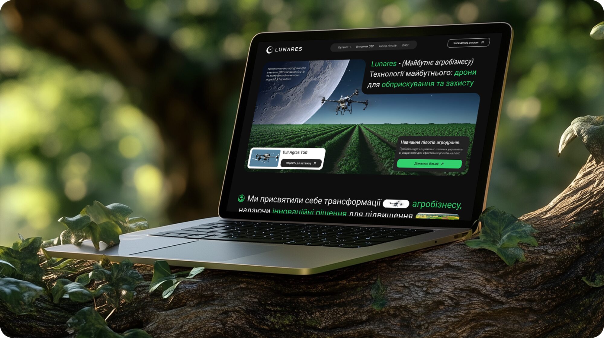
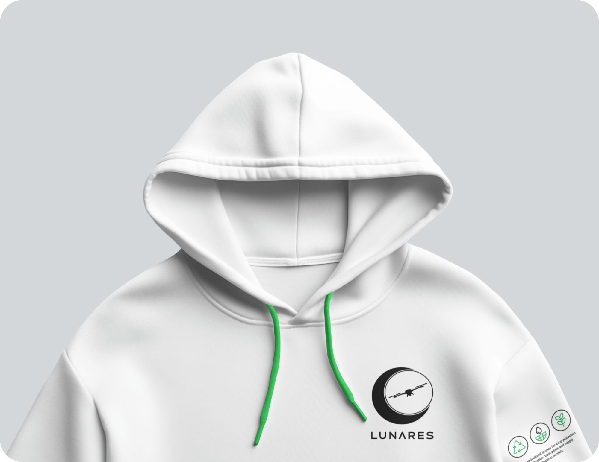
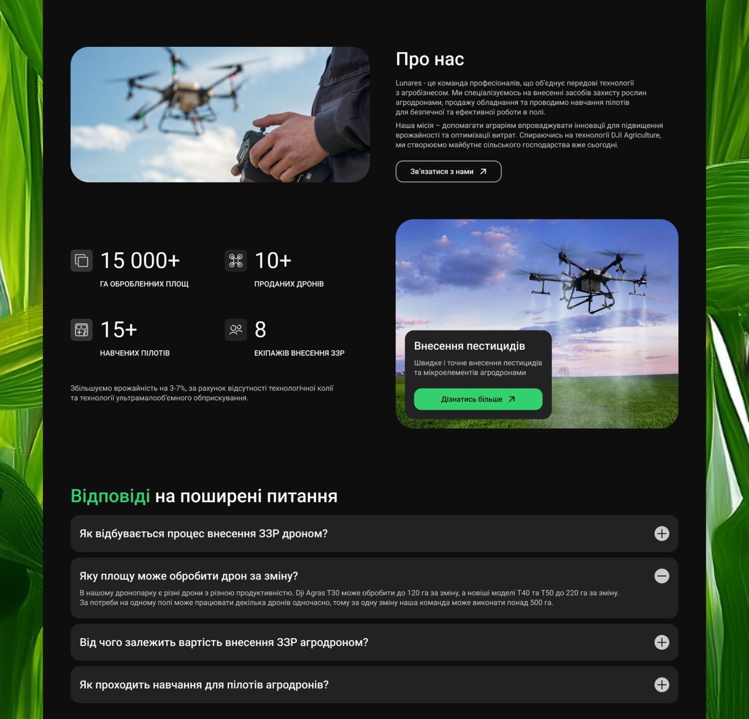
The project included the development of a complete brand system, including a website, logo, presentation, and printed materials. The focus was on creating a modern and visually engaging experience that feels consistent across all touchpoints.
- 03
- Home page
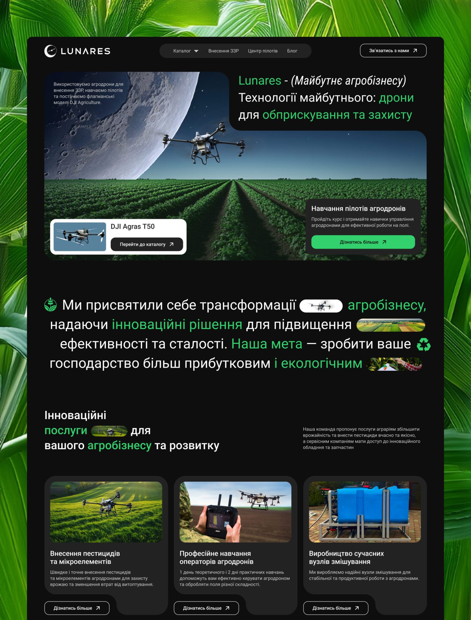
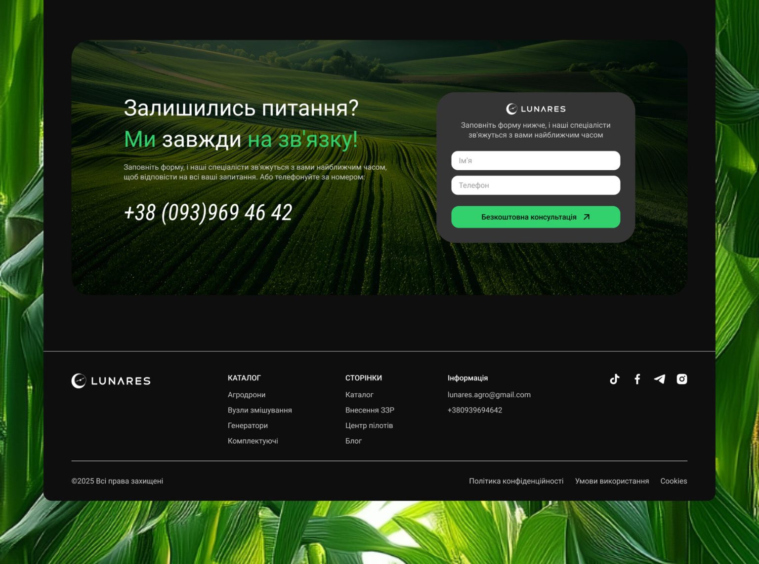
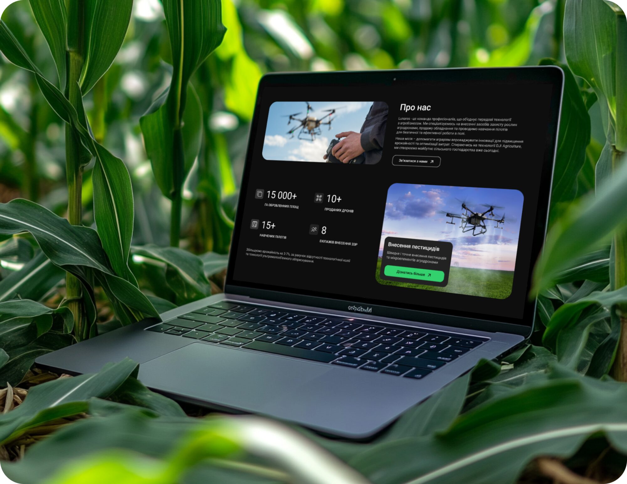
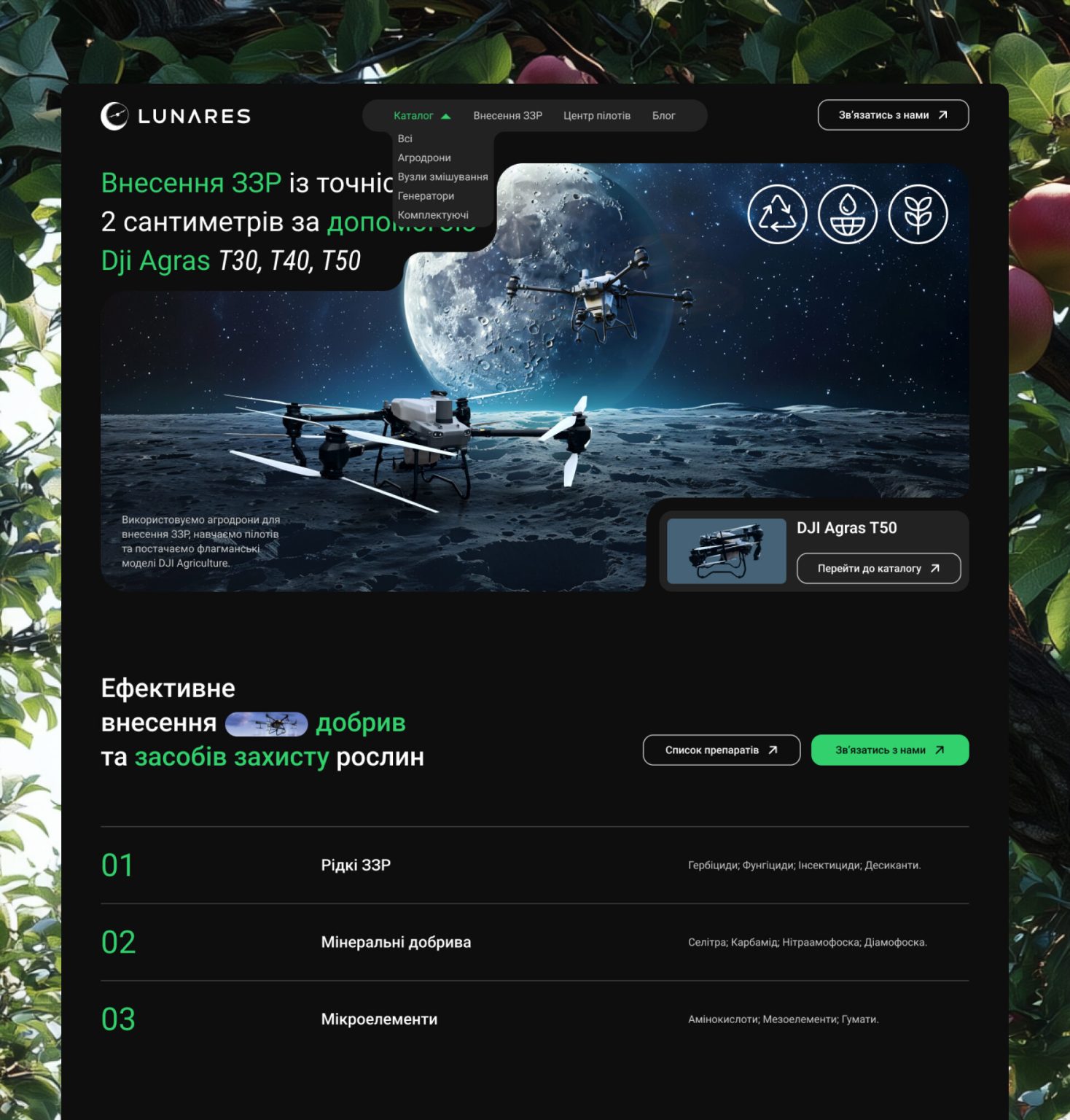
Impossible to Miss
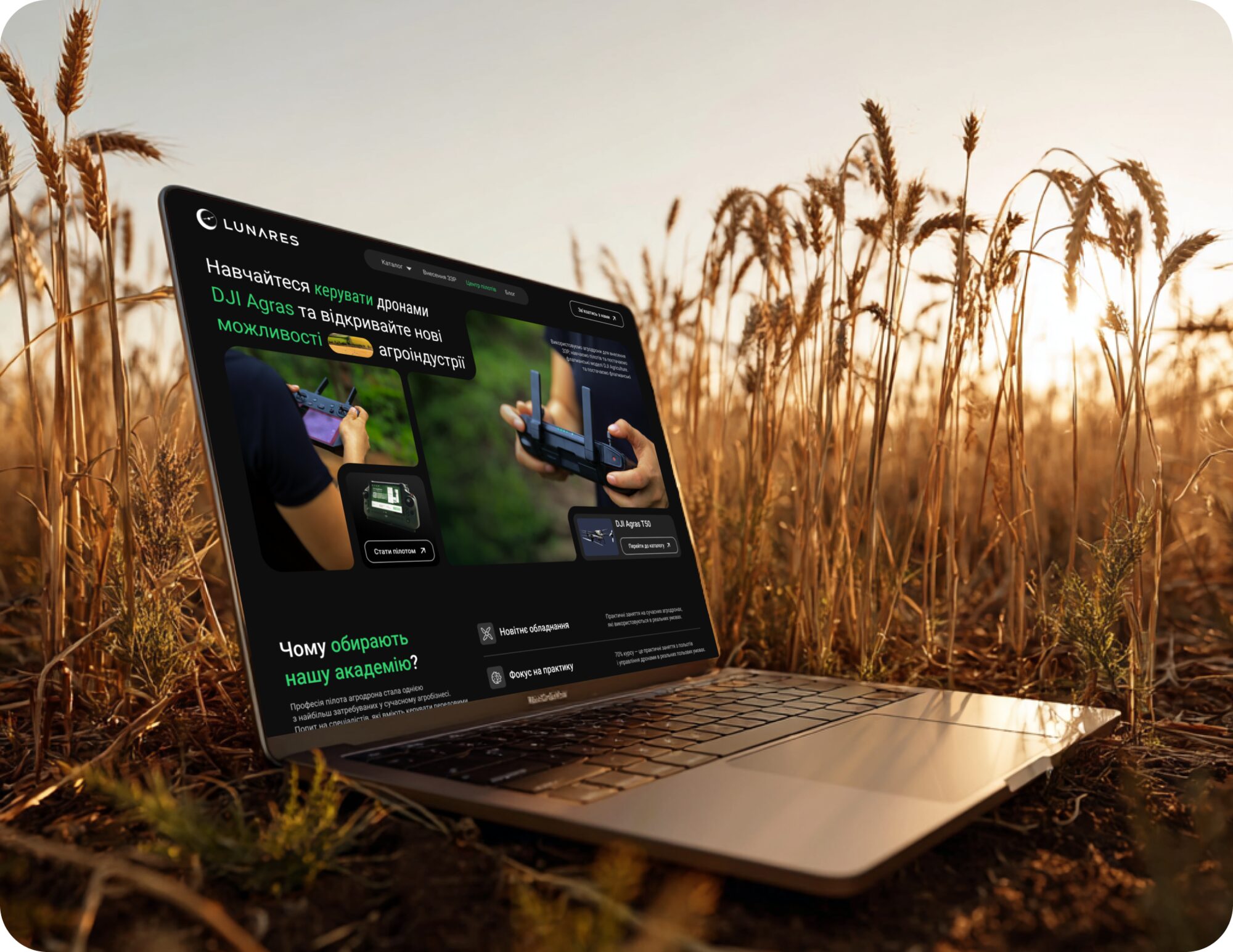
The homepage is designed to immediately capture attention and establish a strong visual identity. An unconventional layout and expressive composition create a unique atmosphere, making the brand memorable from the first interaction.
- 04
- Handheld
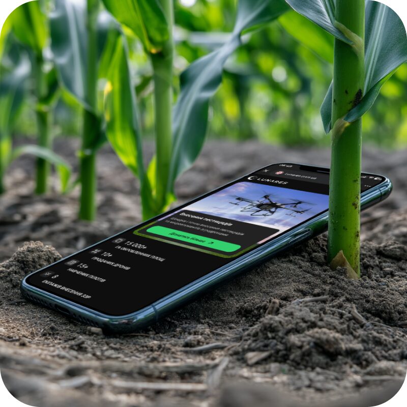
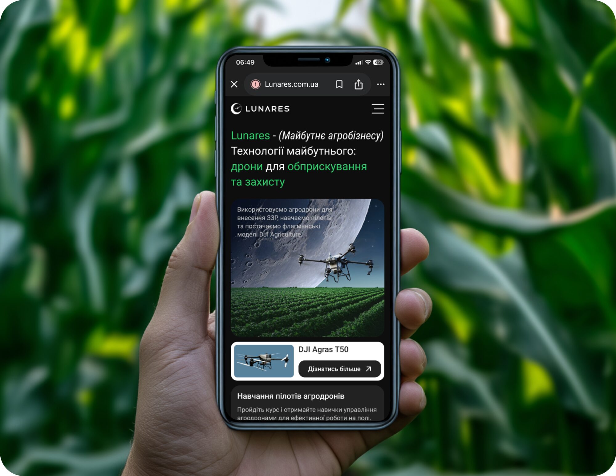
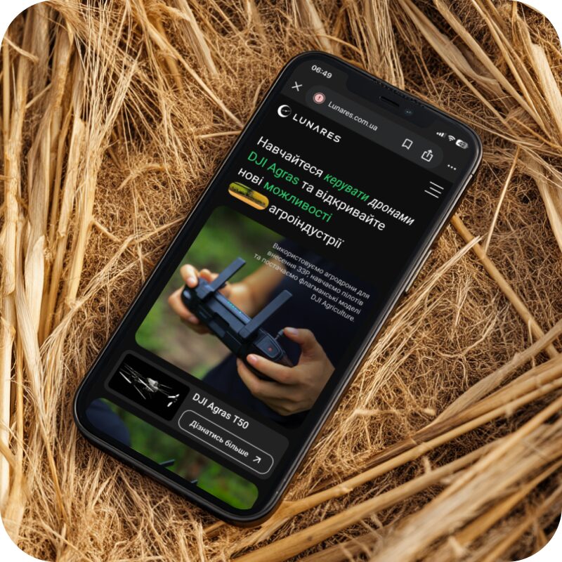
Effortless Experience in Your Hand
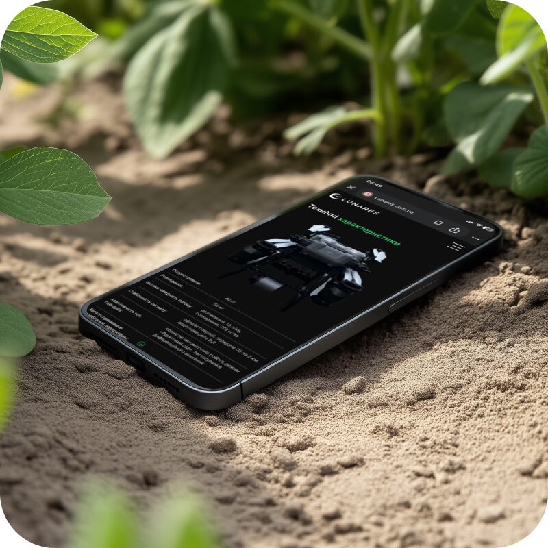
The interface is carefully adapted for mobile devices, ensuring a seamless and intuitive experience in everyday use. Layout, spacing, and interactions are optimized for touch, allowing users to navigate effortlessly while maintaining visual consistency across all screen sizes.
- 06
- Insights
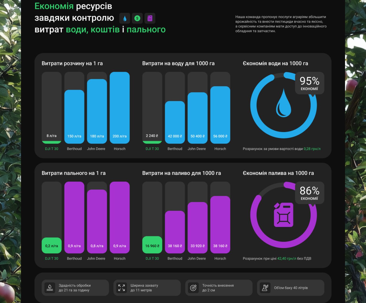
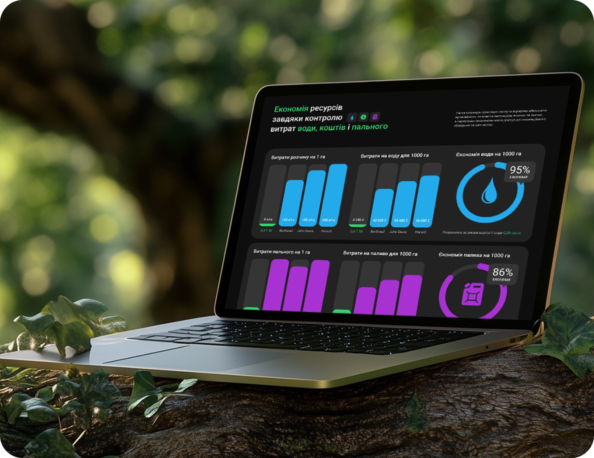
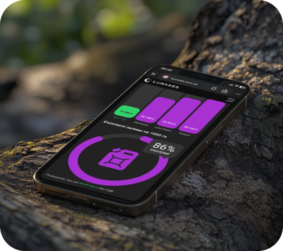
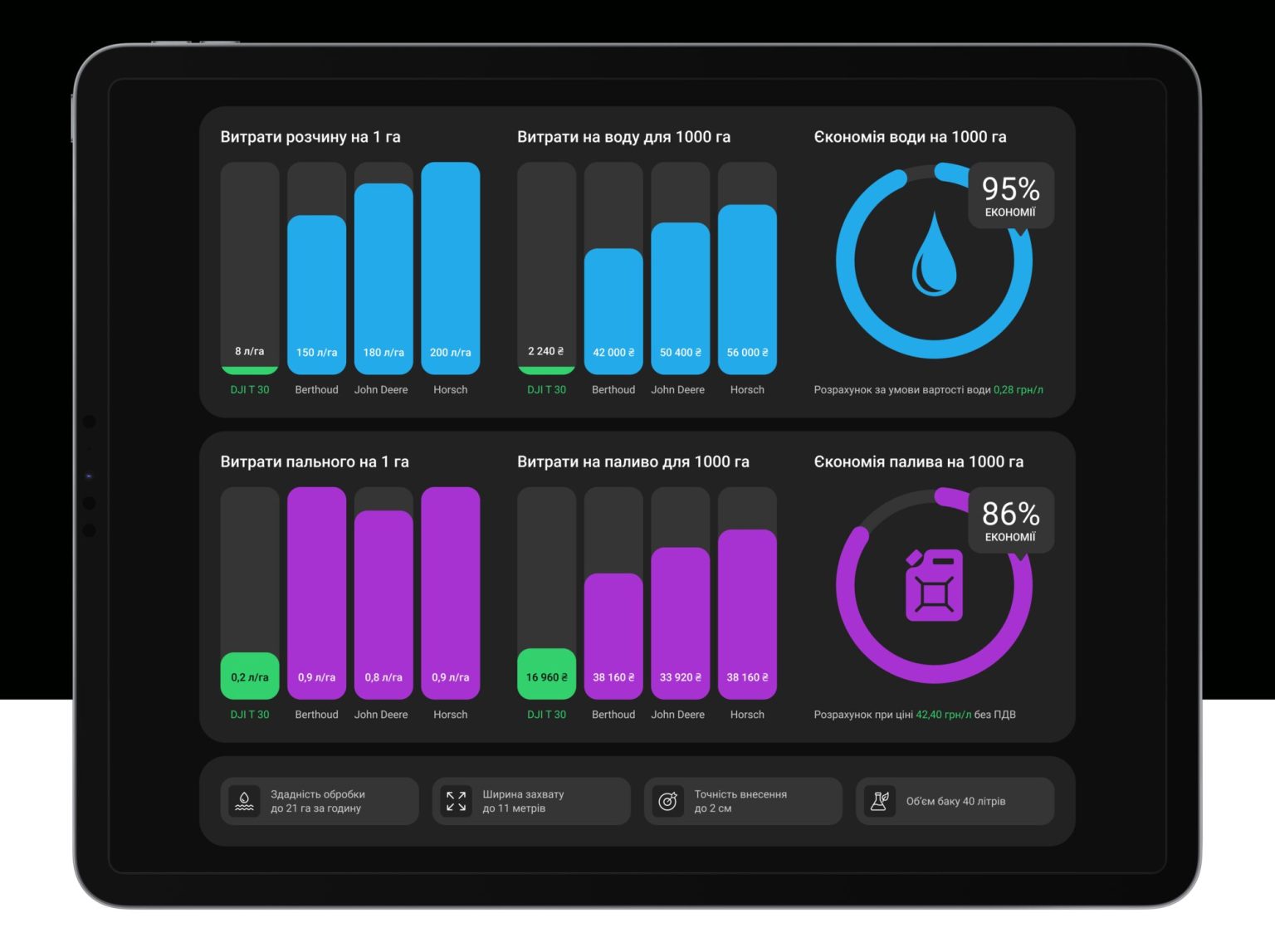
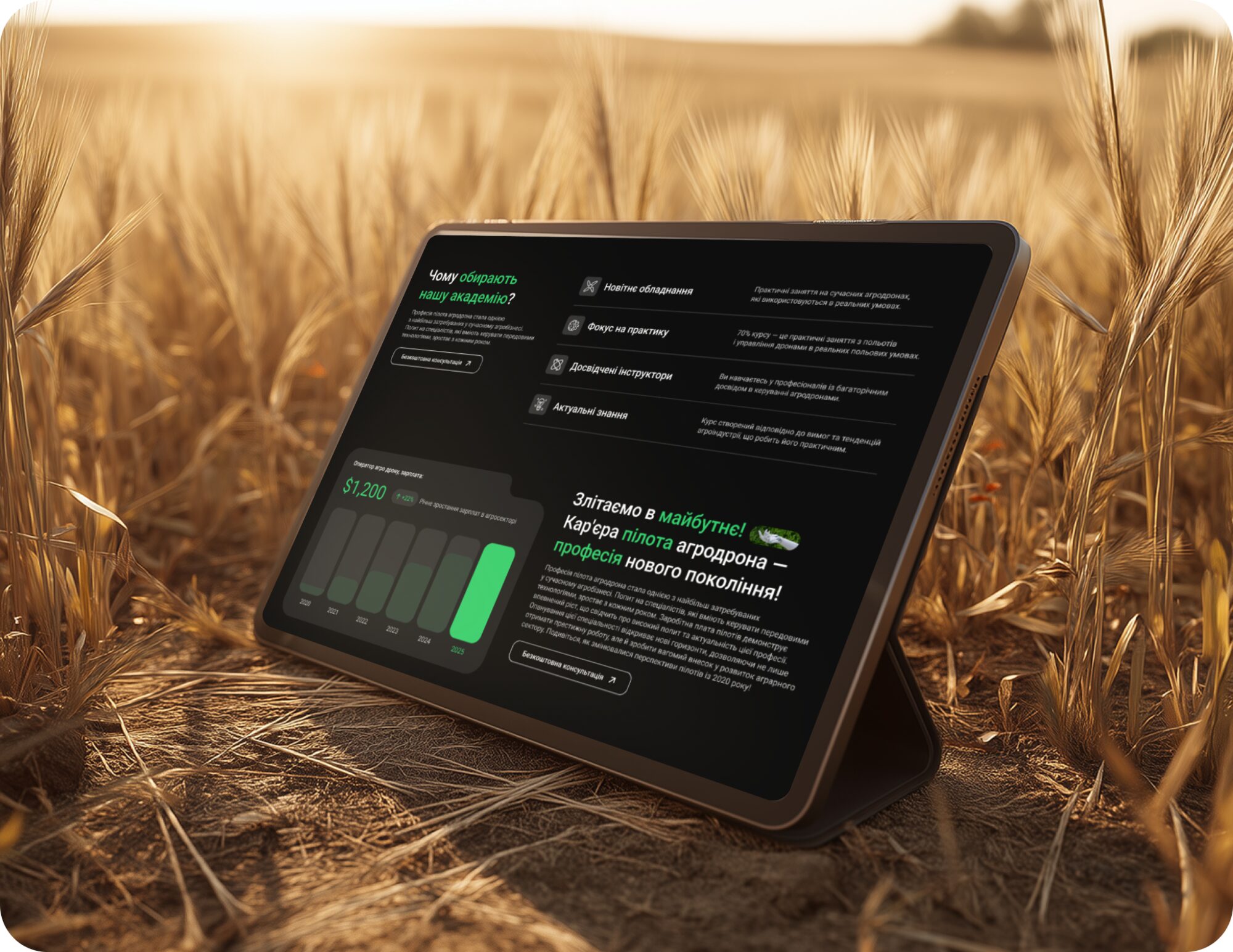
Making Data Speak
Information is presented through a visual, dashboard-like approach rather than traditional tables. This makes complex data easier to understand and interpret.
- 07
- Flow
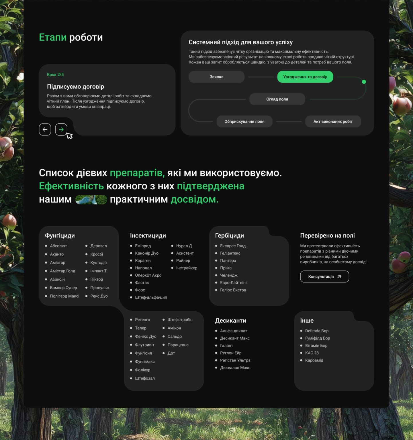
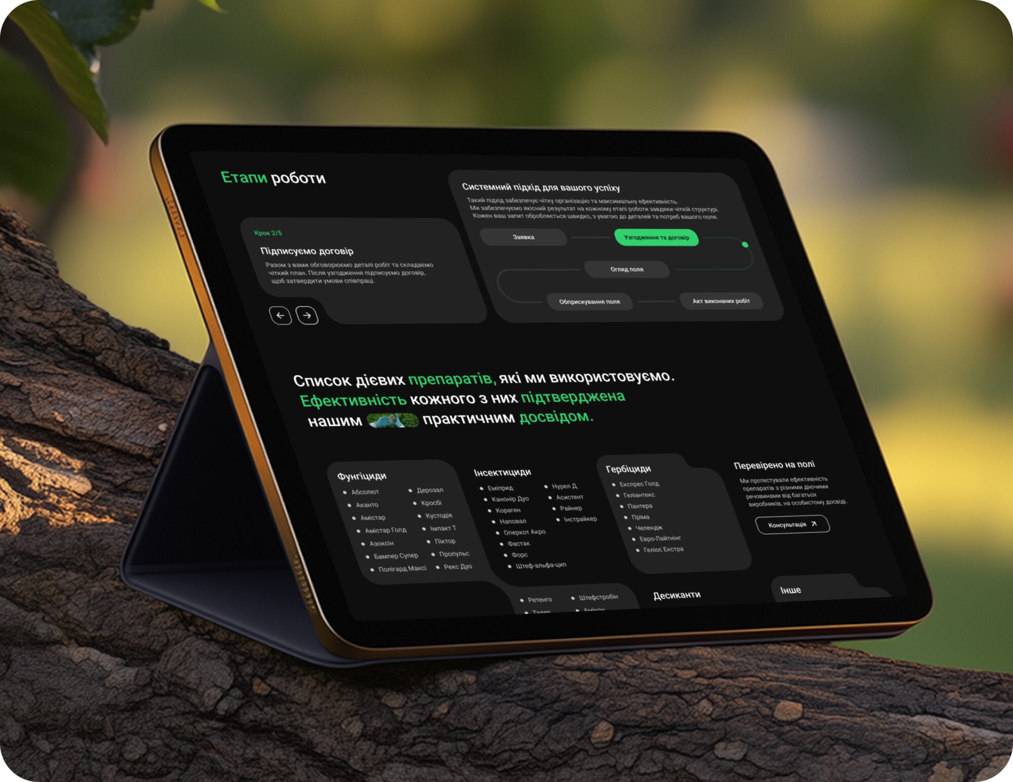
Driven by Interaction
The process is presented through an interactive slider, allowing users to explore each stage step by step. This approach makes the information more engaging and easier to follow compared to static content.

- 08
- Experience
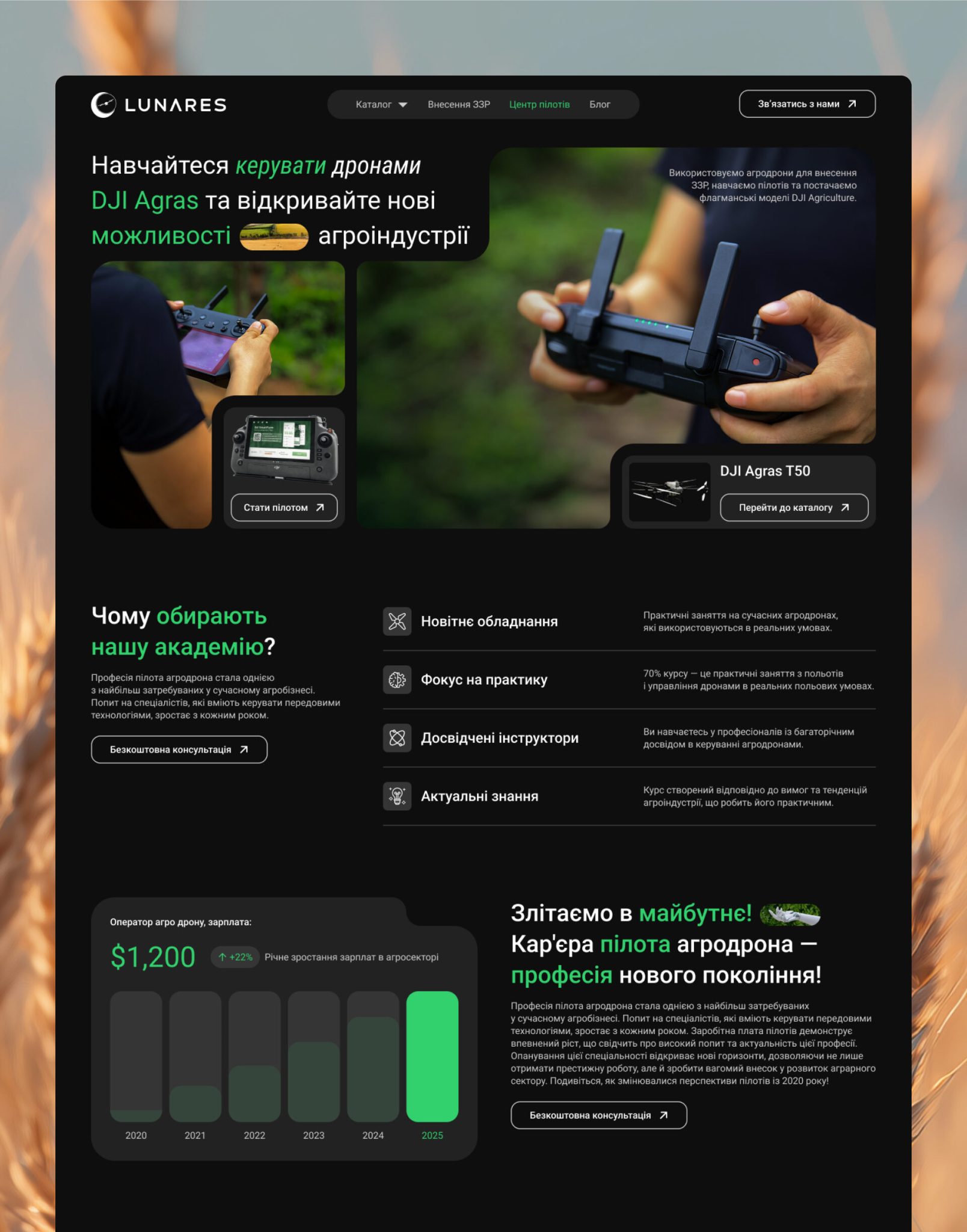
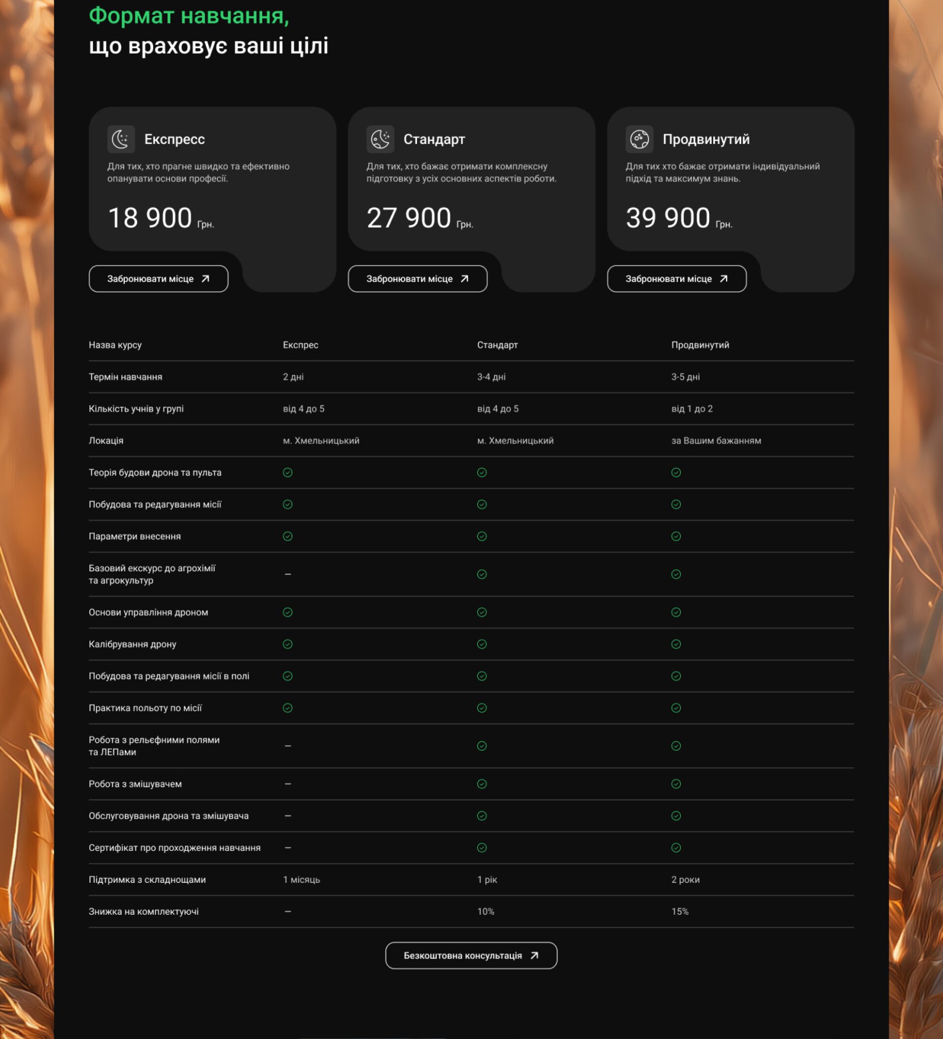
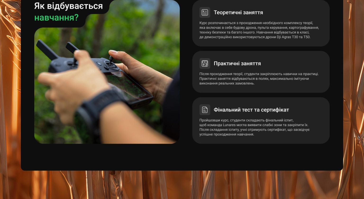
Learn the Craft from Those Who Do It
The page presents the training program as a real entry point into the profession.
Clear structure, career insights, and defined learning formats help users quickly understand
the value and make an informed decision.
- 09
- Hands-on
Take Control of the Process
The main screen builds a strong visual connection to the real work process. It emphasizes hands-on experience, making the training feel practical and directly tied to the profession.
- 10
- Focus
From Clarity to Choice
The content is structured for clarity and easy perception. Visual hierarchy helps users understand the information and move to selecting a program.
- 11
- 404
Not the End of the Path
The 404 page is designed to feel like a natural part of the experience rather than a dead end. Motion and visual cues help users stay oriented and continue navigating.
- 12
- Performance
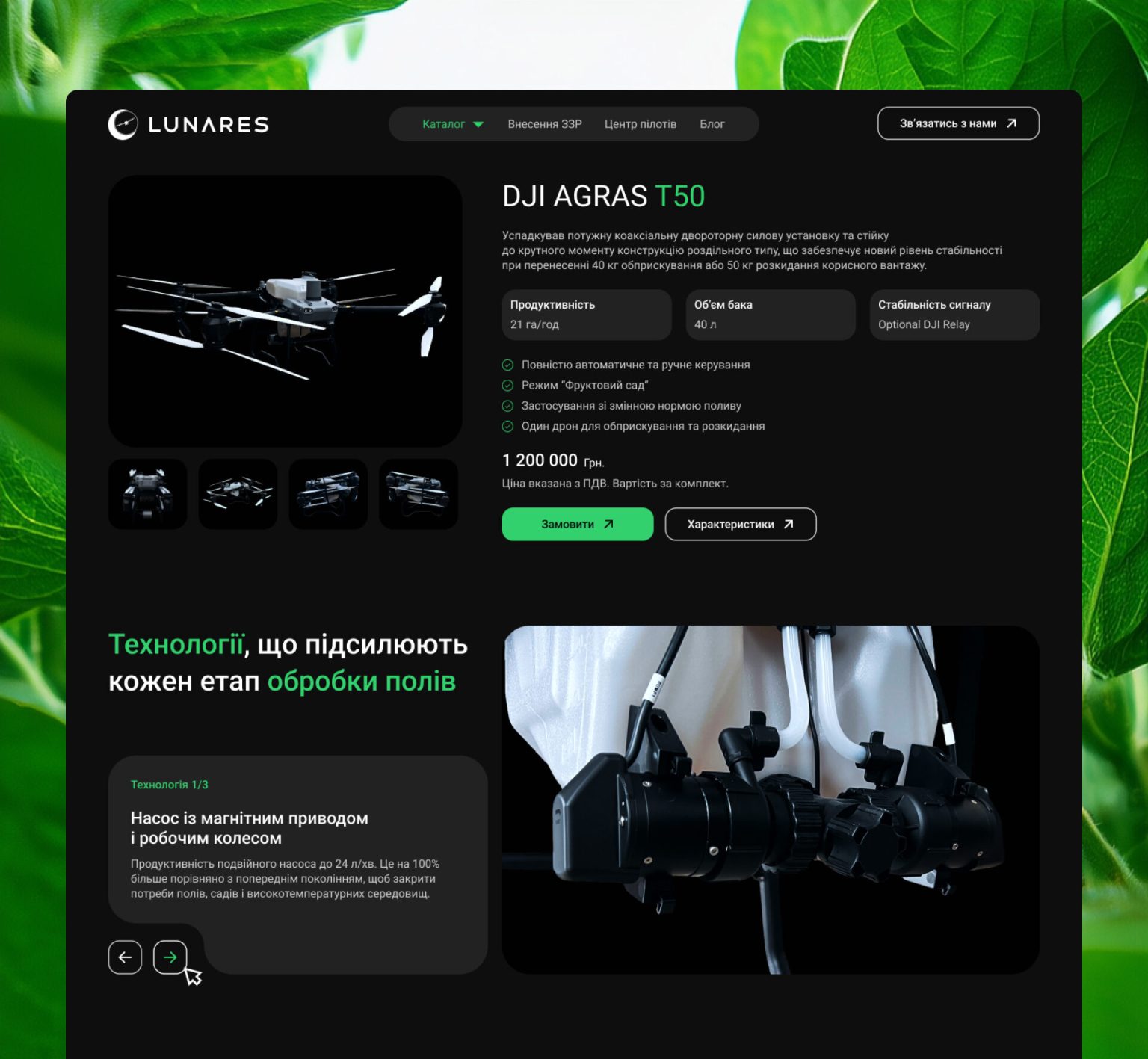
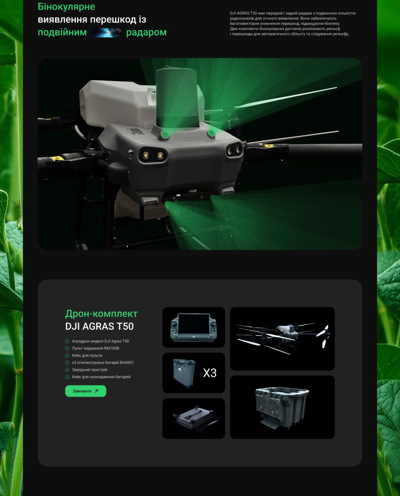
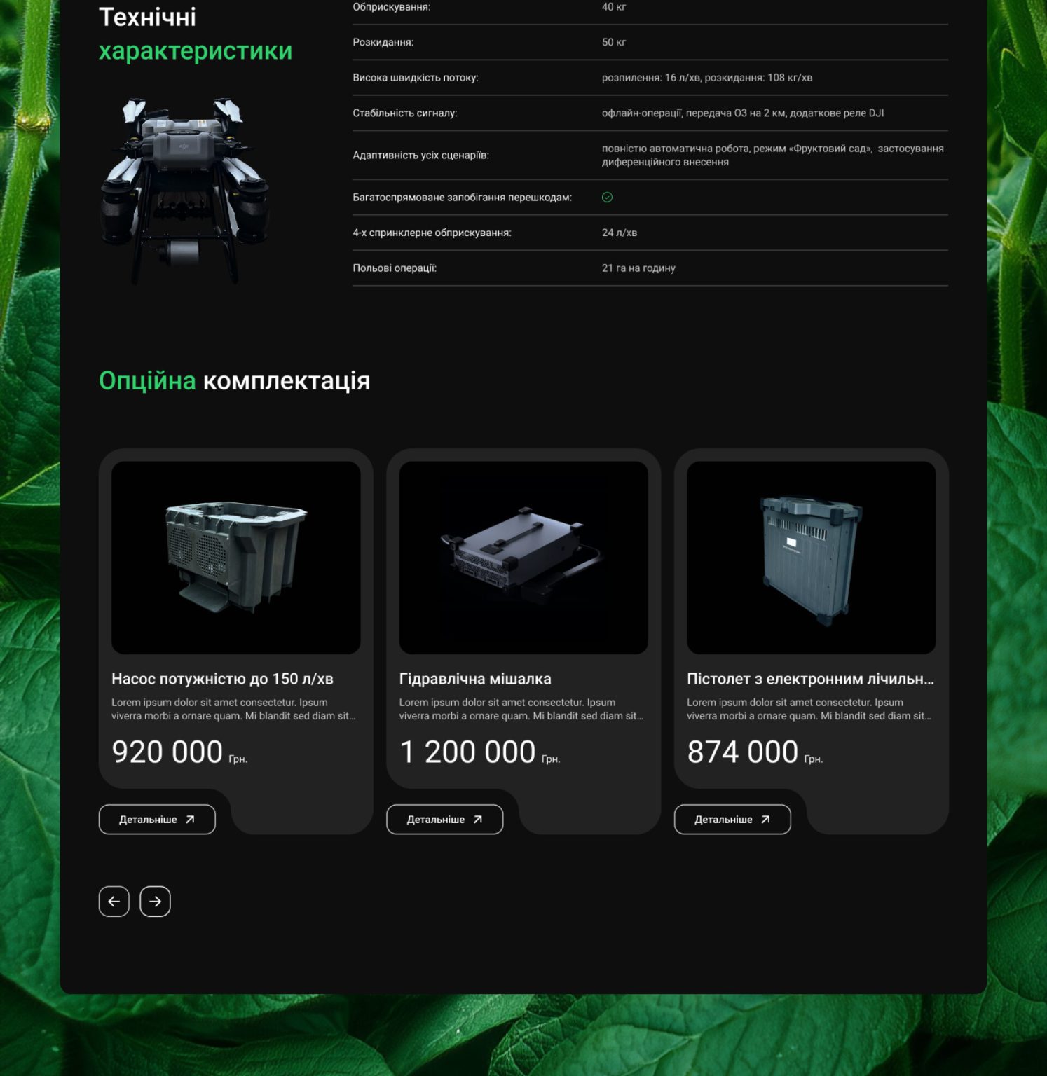
Specifications, Made Clear
The product page is designed to present key features and capabilities in a clear and structured way. It highlights performance, specifications, and real-world value, helping users quickly understand the product.
- 13
- Navigation
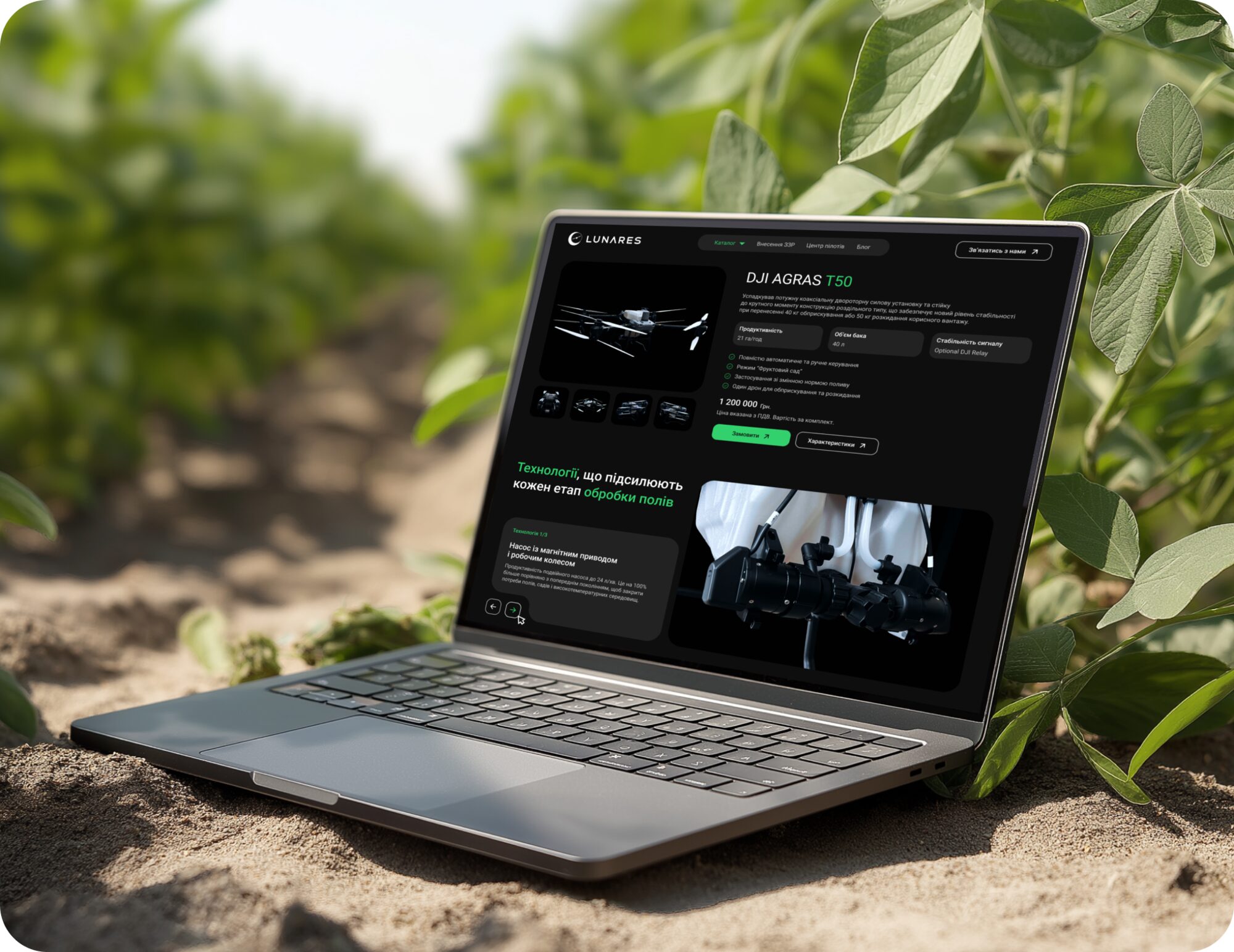
High-value product → consultation-first flow
Unlike the traditional e-commerce model, the purchasing process is consultation-based. The user submits a request, after which a manager contacts them to clarify the details and select the right solution. This approach ensures more precise communication and improves the effectiveness of the interaction.
- 14
- Context
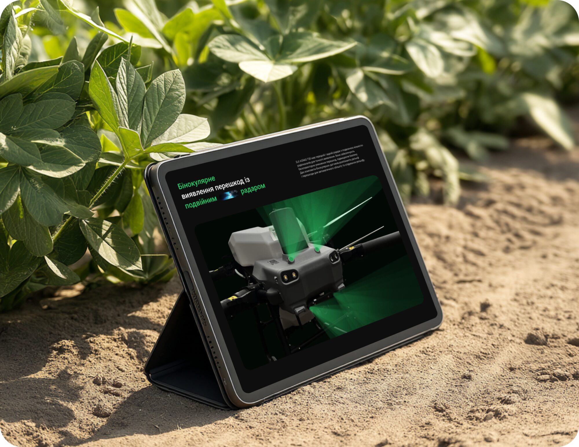
Clear Context for the Next Step
The page sets the stage for further interaction with the user. It helps users understand the product and makes the next step more meaningful.
- 15
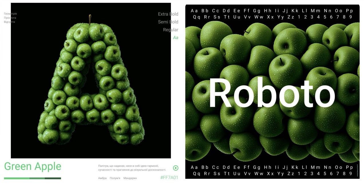
- Identity
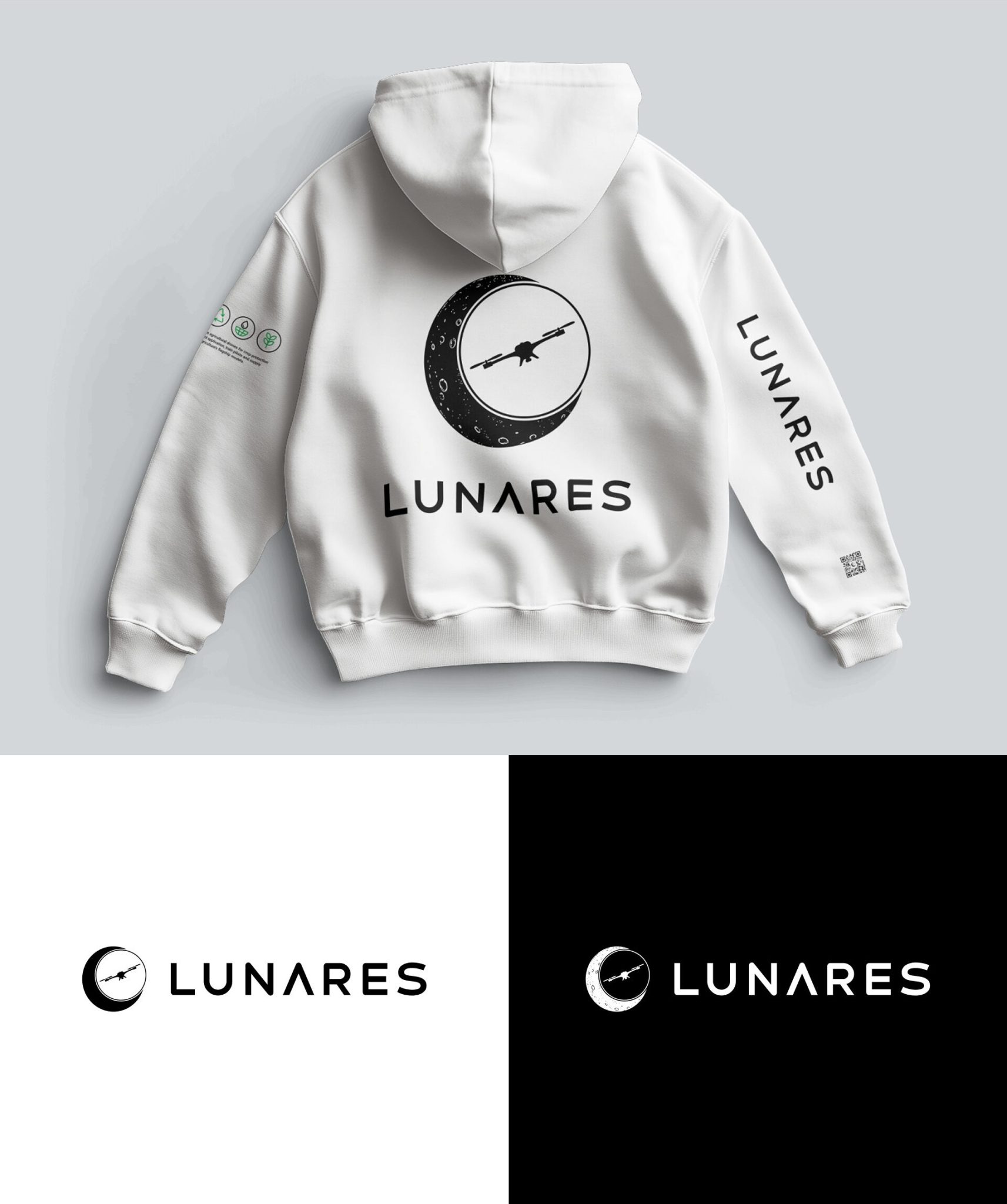
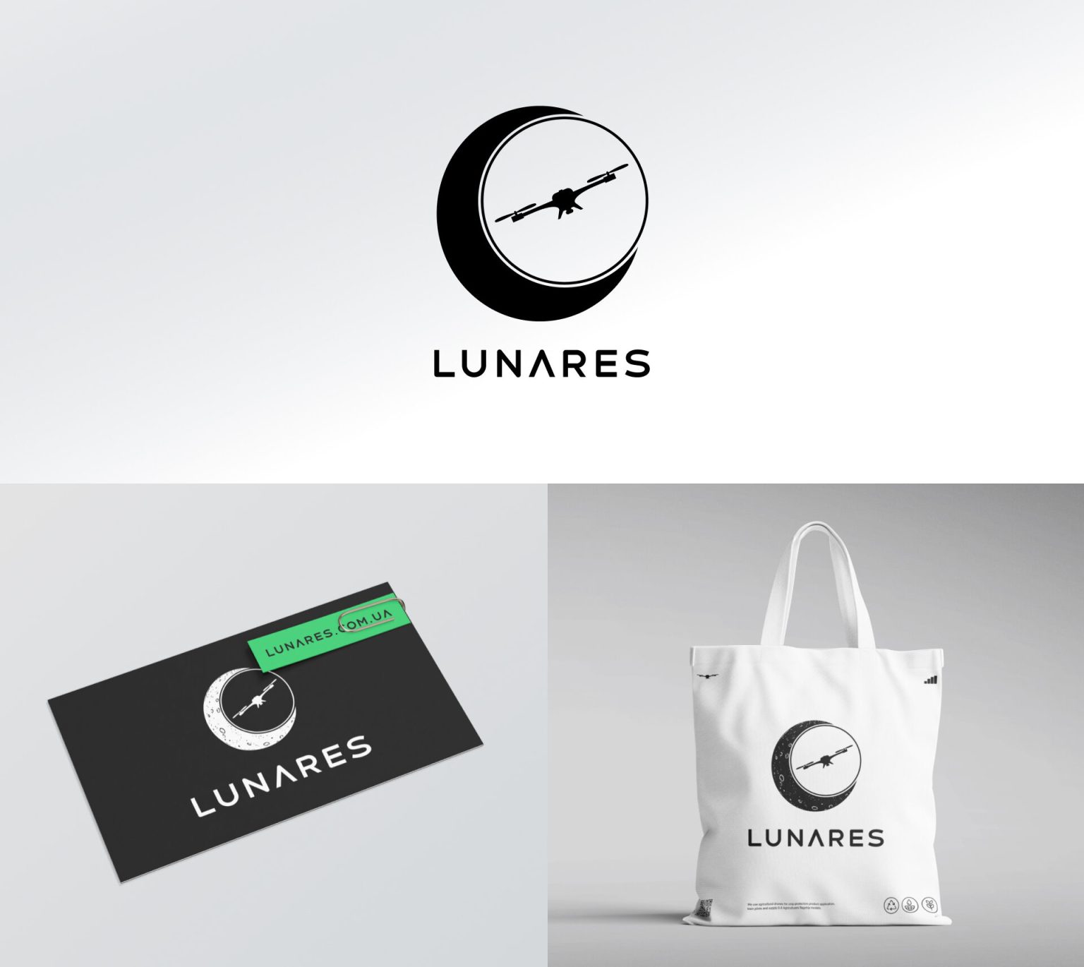
A Flexible Brand Identity
The visual identity is used in various formats and layouts,
maintaining consistency while adapting to different contexts.
Logos, compositions, and color variations form a flexible and recognizable system.
- 16
- Presentation
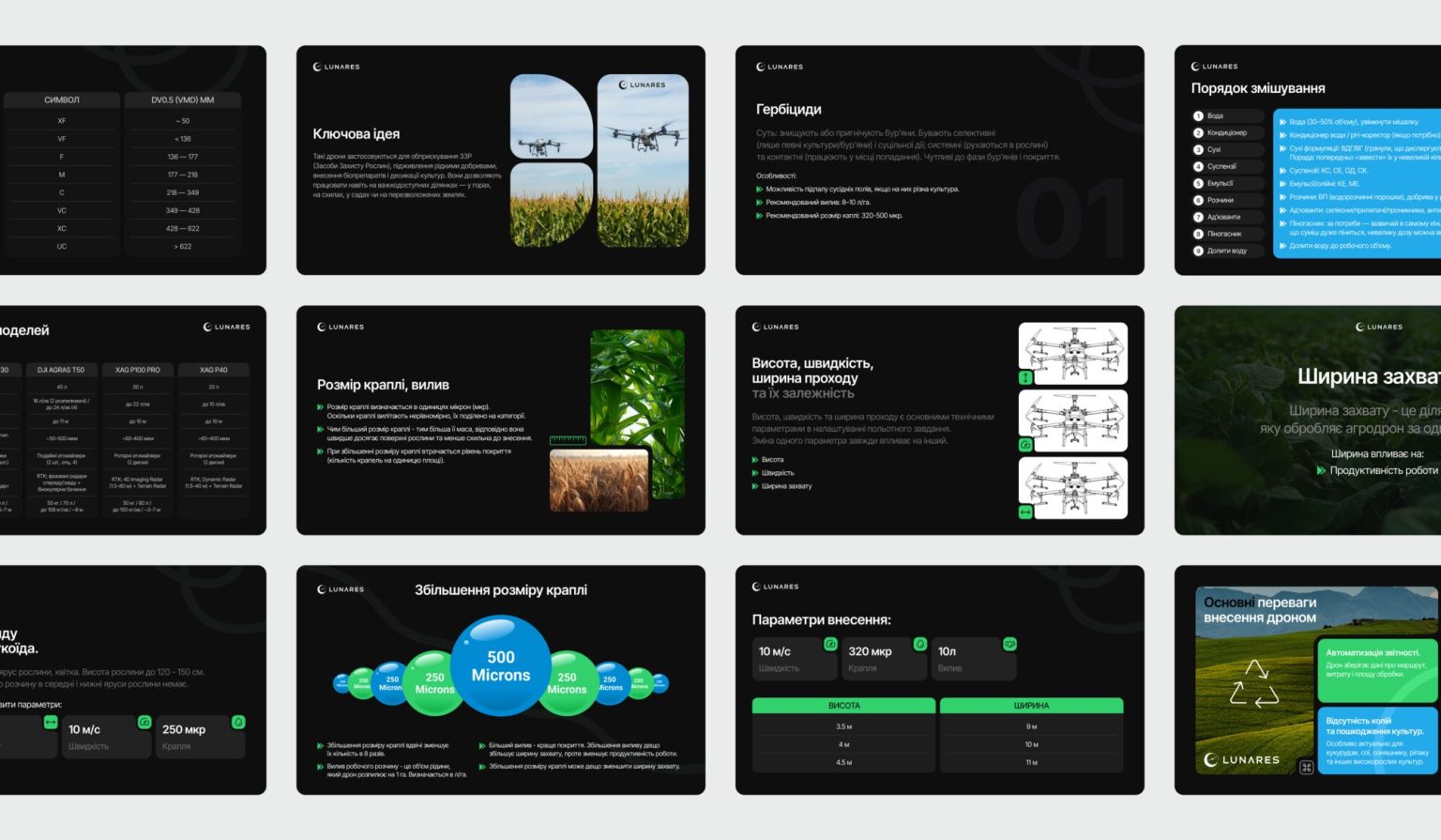
Course Presentation
The presentation represents the theoretical part of the course, preparing users for upcoming practical training. It is divided into four modules and includes over 40 slides, covering key concepts in a structured way. This format also allows the material to be used in both online and offline training.
- 17
- Materials
Beyond the Screen
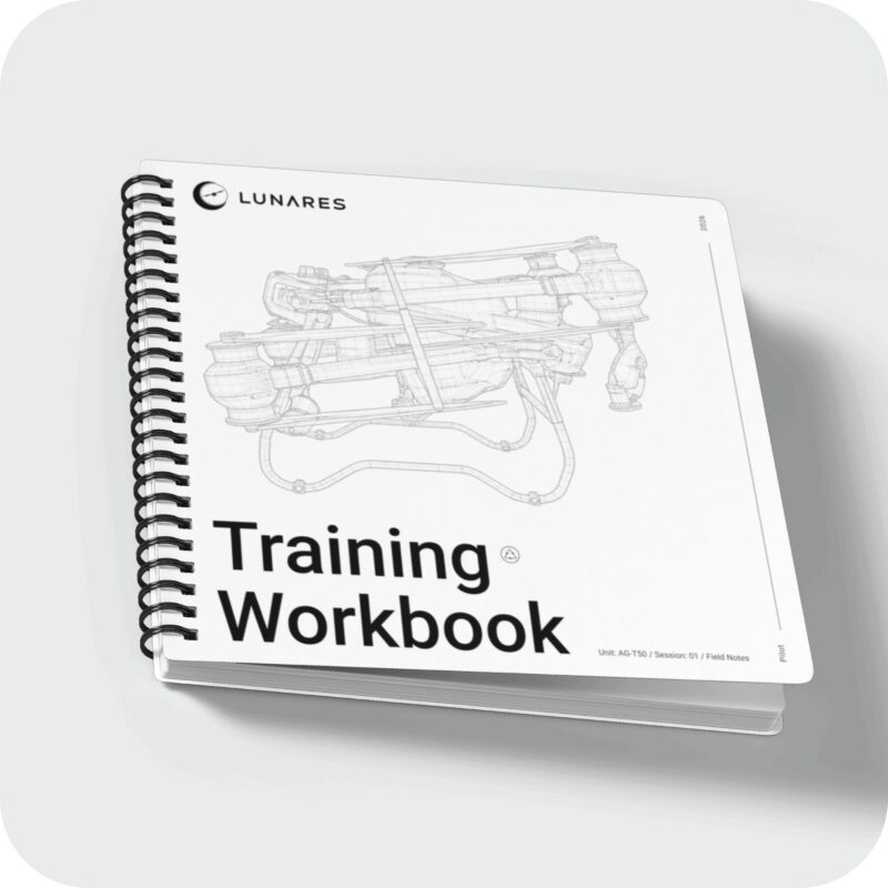
Physical materials such as a workbook and a manual were introduced
as part of the project. They separate note-taking from practical application, creating a more structured way of working with the content.
Even at the cover level, they extend the visual system
and reinforce brand perception.